
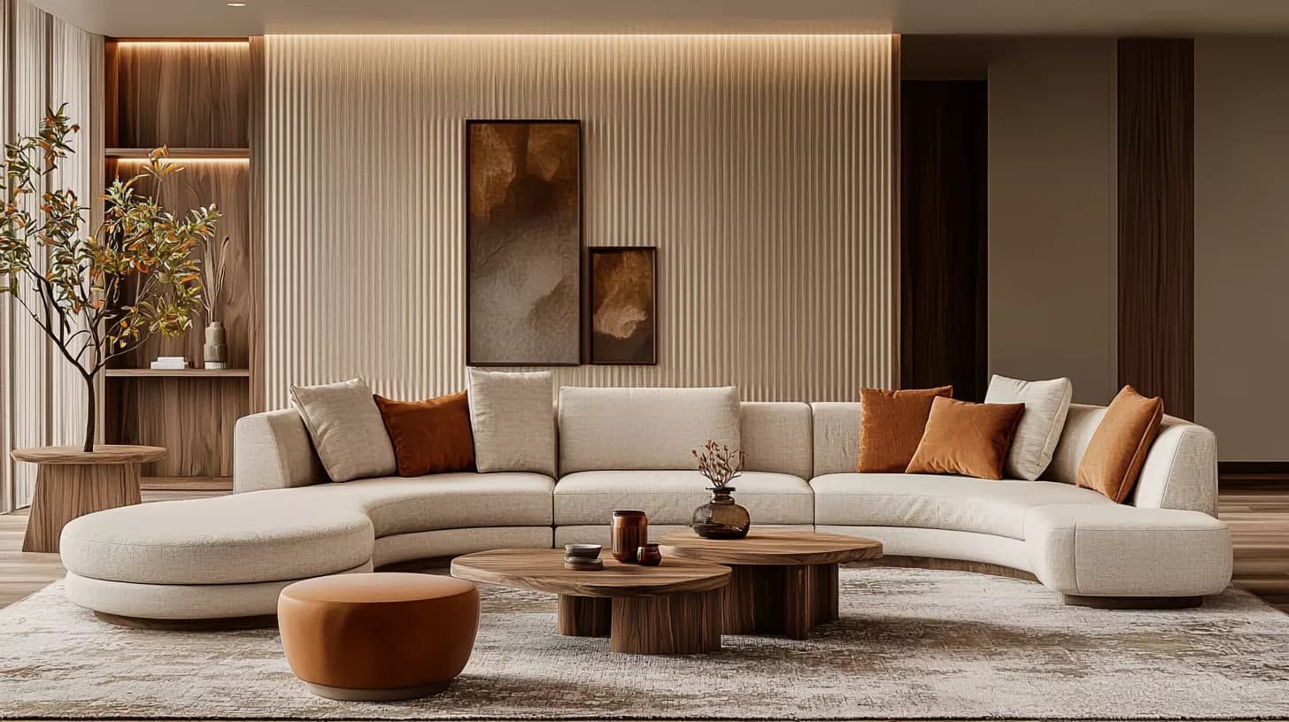
For a warm interior in 2026, start with the flooring and furniture you already own. Choose a neutral base that works with the timber, then introduce green, burgundy or an earthy accent in a defined area. Approve a physical sample in the room before ordering paint or upholstery. A colour-of-the-year announcement offers inspiration; lighting, materials and everyday use determine whether the colour suits your home.
This guide combines documented paint-brand selections with practical wall decor and home decorating ideas. The room images show different ways to coordinate a palette. Comparisons, a worked example and a quotation checklist help you turn an inspiration board into a clear conversation with your designer and contractor.
Colour and design directions to consider in 2026
The useful part of following interior design in 2026 is understanding how colour relates to material and choosing what works in the room. Brand selections include warm neutrals, deep brown and blue-green. These are documented examples from individual brands, rather than evidence that one colour leads global usage.
- A lasting base: flooring, walls and a sofa you can live with over time, with undertones that work together.
- Considered contrast: a dark piece or feature wall that establishes a focus while keeping the furniture arrangement practical.
- Usable materials: fabrics, cleaning and maintenance that suit your household, beyond an attractive texture in a photograph.

2026 interior colours: documented brand selections
The table compares three announced selections for 2026. Application ideas are SMD Decoration recommendations. The room illustrations do not show approved samples of these exact paint codes, and a brand announcement does not establish local product availability.
| Announced selection | Brand and code | An idea for using the colour family |
|---|---|---|
| Universal Khaki | Sherwin-Williams — SW 6150 | Test this warm neutral alongside timber and light fabrics. |
| Silhouette | Benjamin Moore — AF-655 | A deep brown with charcoal notes; consider an element that adds depth to a lighter base. |
| Hidden Gem | Behr — N430-6A | A smoky blue-green jade; compare it with the actual flooring and curtains. |
Check the original announcements linked below. Record the brand, colour code, product and sheen in your approval schedule. Similar colour names from different manufacturers do not make the finishes identical. Matching a colour in a locally available brand requires a physical comparison.
Green and blue-green: balance with neutrals and wood
First decide what a deep green or teal will do: cover a wall, upholster a chair or appear in artwork. A large wall has a stronger presence than a cushion. Review the visible area from the doorway and your usual seat. Light upholstery and medium or dark timber can create clear contrast, provided you review the samples together.
A green colour is a visual choice. It does not establish a material's sustainability or promise a mental-health benefit. Indoor air quality, material sourcing and performance in use require their own product and site information.

Red and burgundy: a clear accent without visual crowding
Burgundy can highlight a chair, two seats or a cabinet front in an otherwise neutral room. If the existing timber has red undertones and the floor is warm, compare them with the burgundy sample so the shades do not compete. Use a fabric sample large enough to judge its texture and reflection; velvet can look different as the pile and light change direction.
You do not need to repeat the accent in every object. A small connection between seating and artwork or cushions may be enough. Retain space around furniture and practical circulation, and choose table edges and metal details with daily use and cleaning in mind.

Warm neutrals: a flexible foundation
Beige, ivory and khaki may appear similar on a screen, yet show yellow, pink or grey undertones beside the actual floor. Compare several samples close to timber and curtains rather than on an isolated empty wall. A good sofa can often be retained while covers or cushions are refreshed, if the surrounding materials work together.
Add depth through texture instead of collecting many colours: a simple curtain weave, visible timber grain and a rug suited to movement and cleaning. A natural-looking scheme does not require every component to be an expensive natural material. A clear specification and suitability for the task matter.

Bold accents: purple and burnt orange
Purple artwork or a copper-toned chair can refresh a home interior without repainting every wall. Start with one element and compare it with existing pieces before buying a complete set. For a multipurpose room, choose items that can be moved or changed later.
A trend does not require replacing comfortable seating or useful storage. Measure the chair and table footprint, door and drawer swings, and the space needed to use them. An attractive image becomes useful when you can translate it into dimensions and materials that suit your room.

Wall decor 2026: choose the wall and finish first
Identify the wall that deserves emphasis: behind the sofa, at the entrance or near the dining table. Avoid competing strong paint, timber strips, stone and dense metal details on every surface. Select one principal feature, then check outlets, screens and air-conditioning positions before installing a covering.
- Paint: specify surface preparation, primer, product, colour and sheen. Investigate the cause of moisture or peeling before redecorating.
- Timber cladding: request edge, joint and fixing details, access to services, and the board type and finish.
- Wallpaper: check pattern repeat, direction, substrate and adhesive compatibility, and cleaning instructions.
- Artwork: measure the hanging position relative to furniture and check fixings appropriate to the object's weight and wall construction.
In kitchens, bathrooms and frequently touched areas, suitability for use and maintenance comes first. A colour that looks good in a living room does not establish that the same product works on every surface.
Nature-inspired styles: what can you apply?
Express a natural character through timber tones, fabric texture, window views and plants suited to the available light. Choose planting according to the room and the maintenance you can provide. Plants do not replace resolving ventilation or damp problems.
Curves and geometric details inspired by Art Deco can appear in a mirror, lamp or furniture piece. You do not need to label them the dominant style across all markets in 2026. Select details that fit the room and the rest of the home, avoiding several competing style signals with no connecting idea.
A comfortable room can be straightforward: a suitable reading seat, a table within reach and curtains that manage daylight. An open plan affects circulation, privacy, cooking smells, sound and services. Do not remove a wall solely to imitate a trending image; refer structural or service changes to the appropriate specialist.
Lighting and physical samples before colour approval
Sherwin-Williams explains that light type and finish sheen influence how a paint colour appears. Examine the sample in daylight and under the lamps you will use in the evening, from several angles. Digital previews narrow the shortlist; approval needs a physical sample beside the room's actual materials.

- Bring flooring, timber, fabric and paint samples together on one board.
- Record the test location, review time and lighting used.
- Assess colour, sheen and surface texture together.
- Discuss availability, lead time and batch matching with the supplier.
- Document the approved sample and code before painting a large area or ordering custom upholstery.
Plan general illumination, task lighting such as reading, and accent light for artwork or material where useful. Concealed strips alone may not meet reading or preparation needs. Review fitting positions, glare and maintenance with the lighting designer.
A practical scheme for an existing living room
Suppose you have beige flooring, an ivory sofa and a walnut cabinet you want to retain. A starting proposal might use warm neutral walls, a green chair or earthy cushions, and a light curtain. This is a discussion example, rather than a fixed recipe. Pink undertones in the floor or limited daylight may call for different paint and fabric shades.
Test two options first, comparing cost, scale and timing. One option retains the walls and refreshes fabric and artwork; another introduces a feature-wall paint finish and rearranges the furniture. Prioritise the effect on daily use rather than the number of colours in an inspiration board.
The familiar 60/30/10 idea can serve as a rough reminder to include a dominant colour, a supporting one and an accent. It is not a mandatory formula or a paint purchasing ratio. Large curtains, rugs and timber also affect the overall picture, so assess the entire room from normal viewing positions.
A clear renovation plan: what belongs in the quotation?
Separate design, supply and installation, and identify what remains. “Complete decoration” does not define paint area, board type or upholstery scope. Specific line items make competing quotations easier to compare.
| Item | Define the scope | Review before ordering |
|---|---|---|
| Wall paint | Area, surface preparation, product, colour and sheen | Approved sample, defect repair scope, protection and cleaning. |
| Furniture and upholstery | Piece dimensions, fabric and detailing | Usability, door clearance, lead time and actual warranty. |
| Curtains and lighting | Dimensions, fixing, control and fitting positions | Samples, maintenance and electrical coordination. |
| Cladding and timber | Board type, finish, edges and fixing | Service access, joints and a representative installation sample. |
Record who measures, approves, supplies and installs, with dates for samples, delivery and handover. Review dimensions before ordering custom items. A substitute colour is not automatically approved: compare the replacement sample, price and lead time, then document the decision.
Common mistakes that weaken the scheme
- Choosing paint from a photograph and discovering it clashes with the floor.
- Changing all finishes without bringing the samples together.
- Ordering large furniture before checking door swings and circulation.
- Calling a material sustainable without relevant sourcing, specification or certification evidence.
- Covering damp with new cladding or paint before addressing the cause.
- Adding so many colours and textures that the focal point becomes unclear.
A strong result is a room you can use, maintain and update, with colours suited to the lighting and clearly specified materials. Take the 2026 ideas that serve your home, then document dimensions, samples and scope before execution.
Related interior design guides
- Interior design steps from the brief to handover
- Colour wheel and coordinated colour schemes
- Wall paint ideas and surface preparation
References and their scope
- Sherwin-Williams 2026 selection: Universal Khaki SW 6150
- Benjamin Moore 2026 announcement: Silhouette AF-655
- Behr 2026 selection: Hidden Gem N430-6A
- How lighting and sheen affect paint appearance
Sources checked on 11 October 2026. They document brand selections and paint appearance. Coordination examples and approval steps are practical SMD Decoration recommendations, rather than colour popularity statistics.
Start your dream project today with SMD Decoration
Your space, your vision. SMD Decoration offers interior design, fit-out and renovation in Turkey and Arab markets: homes, apartments, villas, offices, hotels, restaurants, healthcare, education and exhibitions. Reflect your identity, needs and budget.
Explore finishes, painting, upholstery, custom furniture and lighting in modern, classic, contemporary, industrial or eco-conscious styles. Agree services, execution details and handover before work.
SMD Decoration websites
- Main website: smddecoration.com
- Turkey: smddecoration.net.tr
- Oman, Kuwait & Bahrain: turkiyedecoration.com
- Qatar: smddecoration.qa
- UAE: smddecoration.ae
- Saudi Arabia: smddecoration.sa
- Saudi Arabia — additional site: smddecoration.net
- Libya: smddecoration.info
- Iraq: smddecoration.site
- Syria: smddecoration-syria.com
SMD accepts conventional currencies and bank transfers; Bitcoin and other cryptocurrencies are not accepted.
Bring your vision to life with SMD
Share the city, space type, plan, measurements and current photographs, along with daily needs, furniture to retain, budget and target date. Discuss a considered layout, coordinated materials, colours and lighting with SMD Decoration, with a clear scope for design, coordination, fit-out, execution and handover.
Email: info@smddecoration.com
Project enquiry