
Prepared by the SMD Decoration team · Content and references reviewed: 11 October 2026
A colour wheel arranges hues to show their relationships. Use neighbouring colours for continuity or opposing colours for contrast, then coordinate them with flooring, furniture and light. Red, orange and yellow are commonly described as warm; blue, green and violet as cool. A wall-paint decision still needs a physical sample in the room.
This guide explains the wheel and warm and cool colour families, then applies them to living rooms, bedrooms and workspaces. The aim is a palette suited to the actual room and its use. One combination cannot guarantee the same response in every home.
How to read a traditional colour wheel
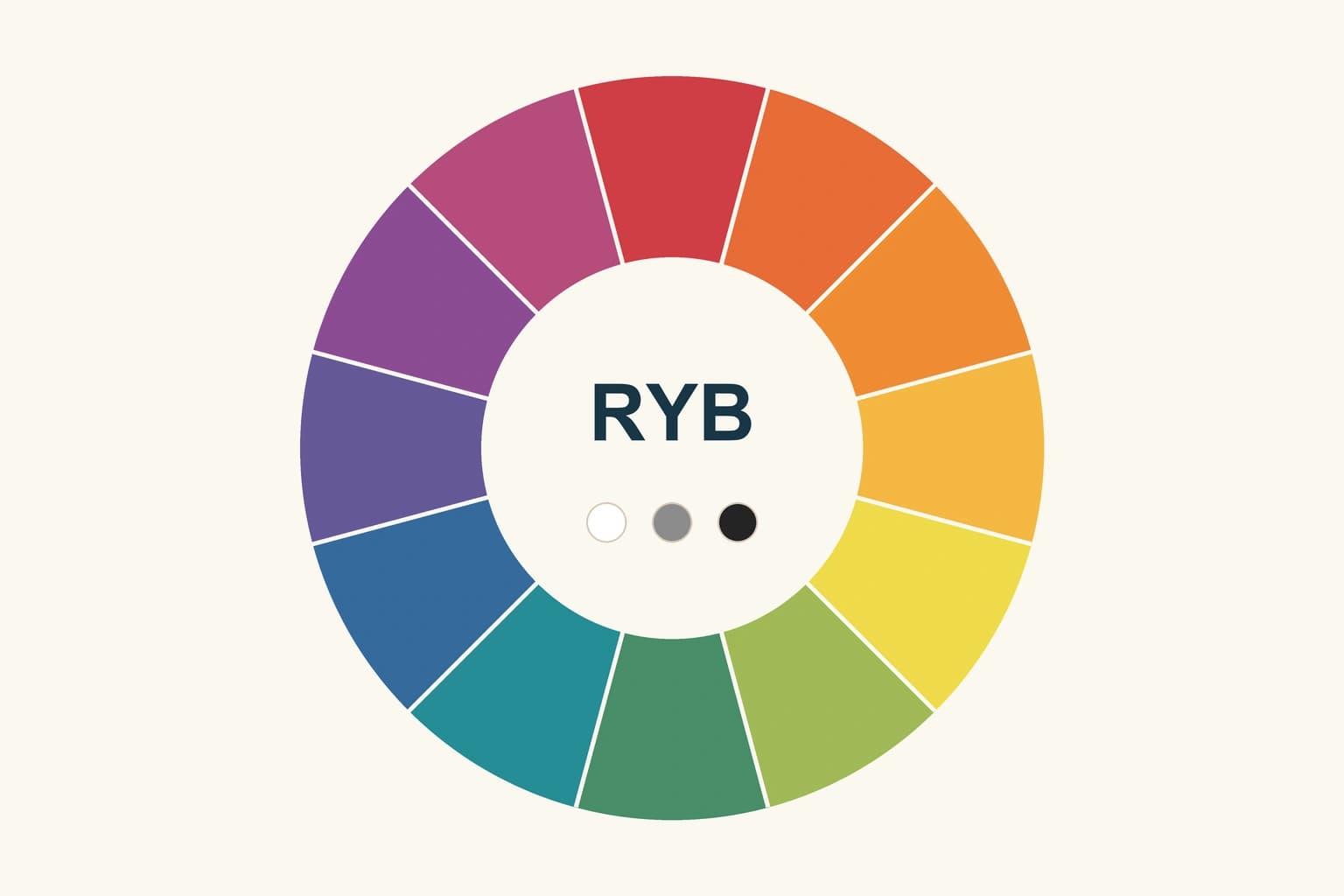
The traditional artistic RYB wheel groups primary, secondary and intermediate hues. The diagram below contains twelve illustrative sectors. Its screen colours represent relationships; they are not manufacturer paint codes or measured mixing ratios.

Primary, secondary and intermediate colours
| RYB group | Example | Use in planning a palette |
|---|---|---|
| Primary | Red, yellow, blue | Understand the artistic wheel |
| Secondary | Orange, green, violet | Locate additional hue families |
| Intermediate | Yellow-orange, blue-green | Find transitions between neighbouring hues |
Blue and yellow are commonly taught as producing green in this artistic model. Actual wall paints depend on their pigments, tint bases and products, so the diagram is not a recipe for mixing quantities. RYB also differs from RGB used for screens and CMYK used for printing. [5]
Warm and cool colours: what is the difference?
Red, orange and yellow are common warm families; blue, green and violet are common cool families. These describe colour appearance and perception, rather than a paint’s thermal performance or a heating or cooling system’s capacity. A particular shade may feel different beside another material. [2]
A white with a yellow undertone may look warmer beside a blue-leaning white. Grey or beige can have pink, green or yellow undertones. Compare candidates with tile, timber and fabric rather than relying on a general colour name. A photograph alone cannot settle the choice.
Keep the warmth of a paint colour separate from the colour temperature of the light source. A different lamp can change how walls and furniture appear without changing the product you bought. Compare your options in daylight and under the lighting intended for the finished room. [2]
Five ways to build an interior colour scheme
| Scheme | Relationship | Interior example |
|---|---|---|
| Monochromatic | Variations within one hue family | Light and dark olive with neutral materials |
| Analogous | Neighbouring hues | Blue, blue-green and green |
| Complementary | Opposing hues | Blue with an orange accent on an RYB wheel |
| Split-complementary | A hue and neighbours of its opposite | A main colour with two restrained accents |
| Triadic | Three equally spaced hues | One dominant colour and two smaller details |
A relationship is the starting point; adjust area, saturation and lightness next. You do not have to use the wheel's vivid hues unchanged. A muted blue and earthy orange may suit the room better than two intense colours, especially when compared against a neutral background. [1]
Analogous colours can connect rooms or materials. Check that the chosen elements remain visually distinct: a change in lightness, fabric or timber texture can help. Evaluate the group in the actual setting rather than approving each sample separately. [3]

Practical examples for a living room, bedroom and office
A living room with timber flooring
Begin with the flooring that will stay. Compare its golden, reddish or grey undertone, then test a compatible wall background and a supporting colour in curtains or a rug. If you enjoy contrast, try it in a cushion or chair before allocating the largest wall to it. Inspect each material in direct light and shade.
A bedroom with a restrained palette
Choose a limited family such as soft green and neutrals, or neighbouring hues with reduced saturation. Repeat one colour in a small detail to connect bedding, curtains and walls. A calm palette is a design suggestion shaped by personal preference; it does not establish a therapeutic effect or guarantee better sleep.
A workspace or small room
Coordinate the palette with the desk, screen and storage positions. Keep key elements visually legible and check reflections from glossy surfaces. Avoid introducing a colour simply to fill every corner. Paint does not increase the physical area; layout, circulation and storage remain essential.

Choose paint colours in eight practical steps
- Identify fixed materials: flooring, doors, kitchen finishes and retained furniture, with photographs or samples.
- Record room use: activities, occupied times and preferred light and contrast.
- Select a leading colour: start with a material or object you like, then compare wall options beside it.
- Choose a relationship: test analogous, complementary or monochromatic alternatives before settling the scheme.
- Allocate visual roles: distinguish backgrounds from details. A visual colour proportion is not a paint quantity take-off.
- Test samples: compare colour, sheen and texture with flooring and fabric under different lighting conditions.
- Record the decision: product, tint base, colour code, sheen, sample reference, location and date.
- Review implementation: surface condition, product compatibility, colour boundaries and quotation scope.
Adobe Color can help explore relationships and create digital proposals. Retain the design palette alongside material photographs, then move to physical samples. HEX or RGB values alone are insufficient for purchasing a matching wall-paint product. [4]

Is the 60–30–10 rule compulsory?
An approximate balance of a main colour, supporting colour and accents can simplify planning. It is a styling guide, not an engineering requirement or a condition for a good-looking room. A monochromatic scheme or another distribution may suit the furniture, openings and finishes. Give each element a role instead of measuring every surface against a fixed percentage.
Common mistakes when coordinating colours
- Collecting attractive individual samples without comparing them together against the flooring and furniture.
- Choosing paint from a screen and skipping a colour-and-sheen sample on site.
- Using every hue at strong saturation and equal area without a visual priority.
- Assuming all whites or greys are neutral without comparing undertones.
- Turning an artistic mixing diagram into a wall-paint recipe without the product's tinting instructions.
- Approving colour before investigating peeling or stains and expecting decoration to conceal the cause.
Related paint and colour guides
- Compare paint colour mixing with white and actual samples
- Explore modern wall-paint ideas and preparation
- Choose the right wall-paint type and colour
References and tools
- Adobe — Colour wheel combinations
- Benjamin Moore — Warm and cool paint colours
- Benjamin Moore — Analogous colour schemes
- Adobe Color — Colour harmony tool
- Adobe — Colour wheel and colour models
Start your dream project today with SMD Decoration
Your space, your vision. SMD Decoration offers interior design, fit-out and renovation in Turkey and Arab markets: homes, apartments, villas, offices, hotels, restaurants, healthcare, education and exhibitions. Reflect your identity, needs and budget.
Explore finishes, painting, upholstery, custom furniture and lighting in modern, classic, contemporary, industrial or eco-conscious styles. Agree services, execution details and handover before work.
SMD Decoration websites
- Main website: smddecoration.com
- Turkey: smddecoration.net.tr
- Oman, Kuwait & Bahrain: turkiyedecoration.com
- Qatar: smddecoration.qa
- UAE: smddecoration.ae
- Saudi Arabia: smddecoration.sa
- Saudi Arabia — additional site: smddecoration.net
- Libya: smddecoration.info
- Iraq: smddecoration.site
- Syria: smddecoration-syria.com
SMD accepts conventional currencies and bank transfers; Bitcoin and other cryptocurrencies are not accepted.
Bring your vision to life with SMD
Share the city, room plan, photographs of flooring, furniture, curtains and lighting, preferred colours, budget and project date. Discuss a coordinated palette and paint and material samples with SMD Decoration, with a clear scope for design, coordination, preparation, implementation and handover.
Email: info@smddecoration.com
Project enquiry