
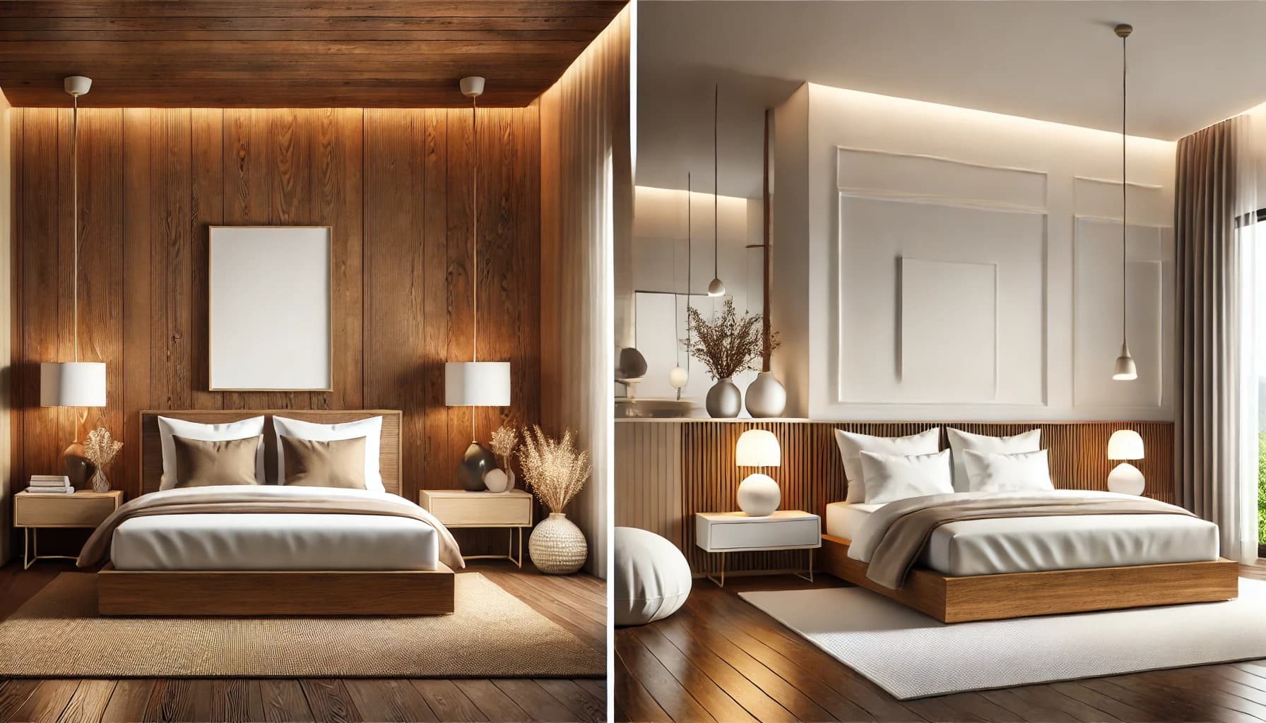
Neither wood brown nor white is universally better for a bedroom. Choose brown to emphasise grain or a richer visual composition, and white for a lighter backdrop or selected uniform surfaces, then test the choice with the room’s daylight and flooring. Combining them can work well when each material has a clear role instead of relying on matching colour names.
Compare actual tones and materials
Wood brown covers a wide range: light or dark, with reddish, yellowish or greyish undertones. The name alone does not identify walnut, oak or solid timber. Grain may come from veneer or a printed surface; the product specification establishes material construction, quality and care requirements.
White also includes many shades, with creamy, greyish or other undertones becoming noticeable beside neighbouring samples. Request the colour name or code, product, sheen and approved sample. A matt wall and a differently finished white cabinet may not match even if both are described simply as white.
A comparison for making the decision
| Consideration | Wood brown | White |
|---|---|---|
| Intended appearance | Grain, contrast or visual depth depending on the tone | A light backdrop or uniform surface depending on the tone |
| Large surfaces | Assess the full cladding area, not just a small sample | Assess undertones beside floors, ceilings and furniture |
| Coordination | Compare grain, undertones and sheen across pieces | Compare whites across paint, cabinets and fabrics |
| Care | Depends on the material, finish and product instructions | Depends on the material, finish and product instructions |
| Budget | Specify veneer or surface, details and installation | Specify coating or cladding, details and installation |
Two shades within one colour family can differ more than the broad brown-versus-white label suggests. Colour alone does not establish durability, cleanability or suitability for every room.
Use the image as a palette concept
The archive comparison shows one composition with extensive brown cladding and another with more white surfaces, while both include timber elements. Use it to discuss visual preference, then test your own materials on site. Different room arrangements and lighting prevent it from being a controlled test of colour alone.

Light and sheen change the reading
Sherwin-Williams explains that lighting type, direction and paint finish can change a colour’s appearance. Compare samples under the same conditions and use physical samples rather than a screen alone. This is an observation principle, not a universal lighting specification.
Test the shade where it will be used with the curtains and lighting that will remain. Review it from the bed and entrance, noting what works and what needs adjustment. If the result disappoints, change one variable at a time rather than replacing light, paint and furnishings simultaneously.
Three combinations to explore
A light backdrop with brown furniture: try a white that relates to the floor with a bed or cabinet showing grain, then connect them through textiles. This is a starting point, not a rule requiring every wall to be white or every timber piece to match exactly.
Brown as one dominant feature: for a headboard wall, compare the cladding area and edges with the ceiling, cabinets and light, then simplify other visual elements. Do not approve a fully clad room solely because a small isolated sample looked attractive.
White with selected timber details: a bed frame, bedside unit or cabinet section may provide the wood element. Compare whites across surfaces, fabrics and doors so differences feel intentional. The relationship between real pieces matters more than a style label.
Small rooms and limited daylight
Start with furniture layout, circulation and the opening of doors and cabinets. A light colour does not fix oversized furniture that blocks movement, and brown does not automatically make a room cramped. Test the contrast you prefer on surfaces seen from the entrance and bed.
Review daylight after curtains are installed and how reading, dressing and circulation will be lit. Do not assume that choosing white replaces appropriate lighting. One user may prefer a darker composition and another a lighter one; preference is part of the brief rather than a guaranteed psychological outcome.
Care and cost: separate colour from performance
Dust or a mark being visible on a sample is different from failure to clean it. Compare the actual product and permitted care method, asking about staining, scratches, edge repairs and changes with use. Wall paint, veneer and laminates should not all receive one cleaning instruction.
Compare quotations for the same core, surface, edging, hardware, quantities, delivery and installation. White is not automatically cheaper, and brown grain is not proof of costly timber. Identify sound existing elements to retain rather than replacing them simply because the palette is changing.
Five steps to approve the room palette
- Collect samples of the floor, doors and retained pieces, and identify what will change.
- Select a small number of specific white and brown product options and assign each surface a role.
- Review them together with fabric, metal and edging samples at the intended location.
- Check daylight and actual evening lighting and record the comparison instead of relying on phone photos alone.
- Approve product, code, sheen, sample and drawing revision, then inspect a site sample before extending the work.
Record the sample identity, date and intended location with the approval. Reassess a replacement material or paint product rather than assuming that similar colour names guarantee a match. This is SMD’s proposed review process, to be adapted to the project.
Reference and scope
Sherwin-Williams: how light and paint finish affect colour appearance. Checked 20 October 2026. The palettes and sample workflow here are SMD design proposals, not promises of better sleep or a uniform psychological response.
Build your bedroom palette with SMD Decoration
Share the room plan, photographs of its lighting, floor samples and furniture to retain, together with your preference for brown, white or a combination. We can discuss colours, materials, furniture layout and the work scope against your brief and budget. You can request a free initial consultation. Discuss your bedroom with SMD.
+90 553 904 12 12
Discuss your project on WhatsApp+966 50 498 6649
Discuss your project on WhatsAppEmail: info@smddecoration.com
SMD websites: Main website · Türkiye · Oman, Kuwait and Bahrain · Qatar · United Arab Emirates · Saudi Arabia · Additional Saudi website · Libya · Iraq · Syria.