a minute idea
Color system in the Year One Thousand Six hundred and sixty, the scientist Isaac Newton designed and planned the first color circle by analyzing light with a glass prism, which became the basis for creating color systems and coordination, which is the reference for creating harmony in a color pattern and relying on it in the fields of graphic design, website design, decoration, choosing the colors of home rooms, curtains, furniture and others.

As we talked in our previous article about the color wheel, which is divided into three types:- primary colors, secondary colors, sub-or intermediate colors, and how to choose between them and coordinate them with space, and here we are SMD decorations company in Turkey, we will talk in this article about the basic color systems and how to use the color circle to create a beautiful, harmonious and harmonious color scheme at the same time.
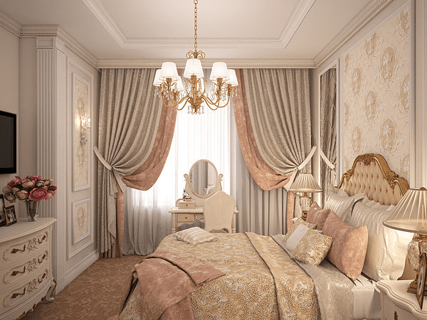
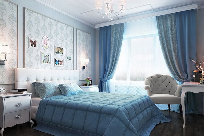
Rule one : monochromatic color scheme


In this rule, we use multiple shades of the same color, either by adding white to lighten or black to darken, and this type is considered the simplest type of color systems in terms of understanding and meaning, and it depends on different shades of the same color, unless attention is paid to texture and pattern, and if we want to make the monochrome system more vivid, we can add bright shades of a color that belongs to another part of the color wheel.


Rule two : symmetrical color scheme
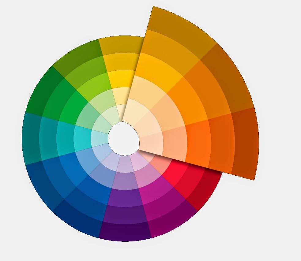
The symmetrical color system uses colors that are close to each other or adjacent in the color wheel, and in this Color scheme it gives greater harmony and is less lively, comfortable for the eyesit is recommended to choose one dominant color with a larger area and the other two colors in smaller proportions to enhance the pattern, it is also recommended in this format to avoid mixing between a hot color with cold colors and vice versa

Examples
Red-the color of the flame – and orangeblue-greenish blue-green
Rule three: integrated color scheme
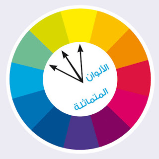
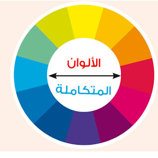
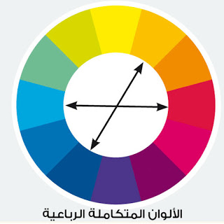
Integrated or complementary colors are all two opposite colors in the color circle, that is, it consists of two colors and gives this pattern a high contrast because we use a hot color with the corresponding cold color, and for the best result, one of the two colors is dominant or dominant in terms of space and add to it the complementary color to give brightness and contrast.
Exapmles
Red + green or blue
Yellow + blue or purple (purple)
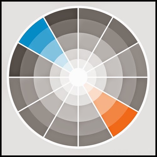
It is worth noting that this Color rule has a great impact and attention should be paid to maintaining balance, noting that equal areas of contrasting colors contradict each other instead of enhancing the effect of each other.
Rule four: split integrated color scheme
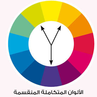
This Color System consists of three colors, two of which are adjacent to the complementary color of the third color, if you want to choose three colors for your design, this is the appropriate format, as it maintains a degree of contrast in addition to harmony, and it is also advisable to choose one dominant color and the other two colors will enhance it.
Rule five: the triple complementary format
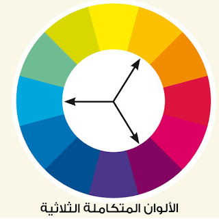
This theme uses three colors with equal distances between them, that is, using an equilateral triangle, this theme gives more balance and is less contrasting.
Rule six: double integral format
This theme is based on four colors so that each two colors are complementary, this theme needs boldness in use and taking into account the proportions and tone of color to get a satisfactory result, and it is also advisable to choose one dominant color to maintain balance.
At the end of this article, we note that the color systems must take into account the choice of the correct color scheme for each design, each according to the data and the space in the project, and also according to the design and the customer's taste.we are SMD decorations and design company in Turkey, we always strive to achieve color balance in our designs and projects.