a minute idea
In this article via SMD we brought you 7-design tips to take from this California home and its elegant monochrome style.
We saw this beautiful integrated design of one of the International Interior Architects and it came to our mind to take it as an example of some design tips that may inspire you on a water day to make your home decorations.
Also, this design followed the classic style-European and luxurious in the city of California, but the freshness of it suggests beauty and warmth and did not use many colors or decorations, on the contrary, it had a lot of simplicity, as it used monochrome colors in this design.
To find out the rest of the tips that the designers of this house followed with this article in the form of points, follow us....
Make the entrance to the House special
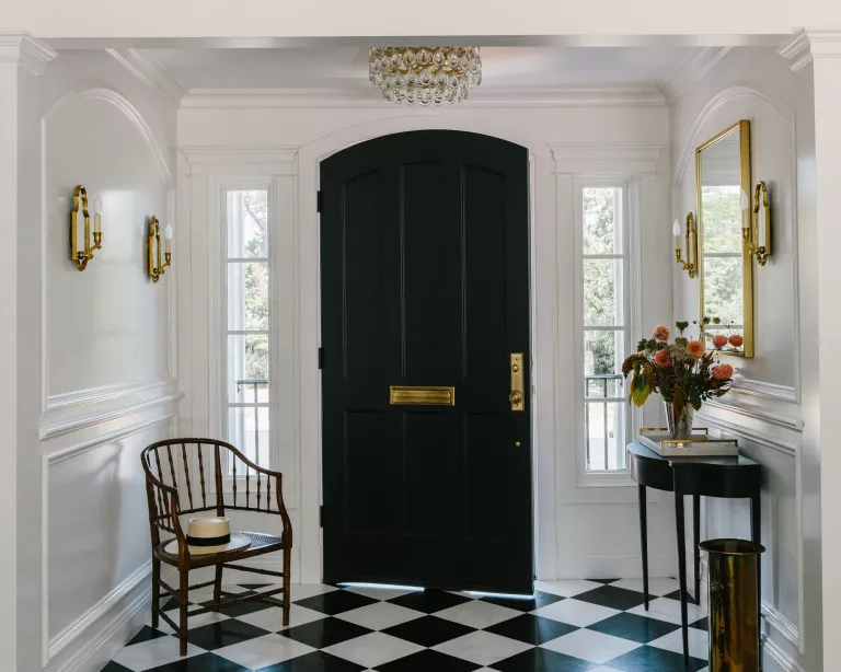
It is important that the entrance to the house is distinctive, for example in this design-design an entrance with a black and white wood floor, white walls, a black door, a gold mirror and a black console table
The decorator said it was very important for them to have a strong sense of entry, which I couldn't agree more. The entrance hall is the first opportunity in any house to show your personality to your guests, which means that strong design data are necessary among the ideas for the hallway. This lobby area has been expanded to a dedicated entrance area.
The decorator who worked on this project said “I like to work in small spaces, so making an impact here was a blast"."The black and white floor tiles were a no-brainer because they appeared again and again in their inspiring photos. The addition of full-height dramatic panels then adds more of the classic European feel we need, along with traditional sconces and a crystal flow holder. They needed a small table only for a variety of practical reasons so that, combined with a mirror, it really brings an element of hospitality.
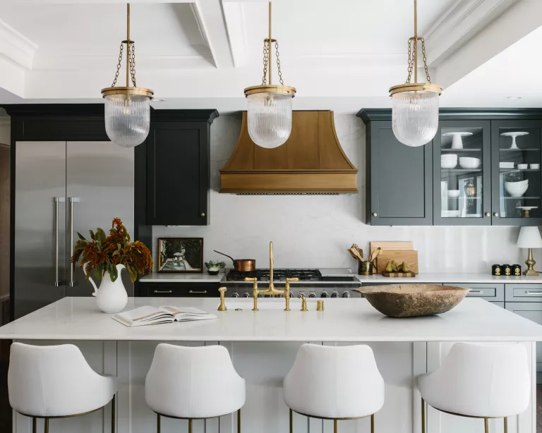
A kitchen with a white marble covered island, white upholstered bar stools, black kitchen cabinets, a bronze hood and hanging lights
"Burrells explained that there should be nothing boho, farm or country about this redesign. The designer explained that it was planned to be classic in black and white and relatively formal. The monochrome look continues beyond the checkerboard tiled entrance to the rest of the house, and makes its presence really felt among the kitchen ideas.
"Their inspiring images of this space were a mix of white and dark kitchens, but the space gets a lot of light and white kitchens are a dime a dozen. So dark has always been my first choice - but since the kitchen is actually not very big, adding white to the island gives the space a more dynamic feel.
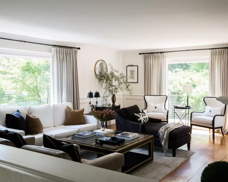
The living room is one of the important spaces in every home, which prefers a balance between the way it feels and how attractive it is.
Getting the living room ideas working well is not without challenges. "The shape was long and narrow and was a challenge when planning the space,"explained Maggio.To make her feel cheerful, the seats have been carefully positioned to create intimate - but connected-seating areas."The solution I came up with is to do a chaise longue between the main sitting space and two chairs by the window. In this way, when entertaining, anyone can sit there and talk with people in either direction.
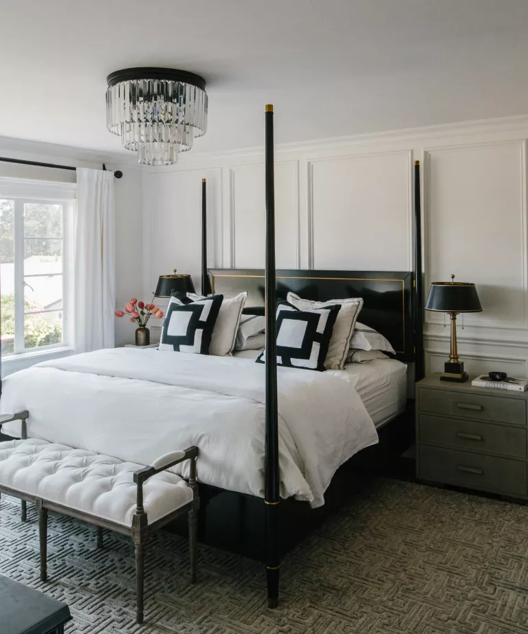
This space was supposed to feel like walking into a hotel room and boy, do you do that at all,"says the designer.The orientation of stylish hotels is a growing trend among Bedroom Ideas at home, especially since working at home means that they are the only haven to relax at home, increasingly, deserving a touch of luxury.
"The bedding, pillows and lighting are all inspired by hotels, and the bedside tables bring texture and softness,"he continued. "The four-poster bed was a hot topic of discussion since the room is actually not very big, but I felt confident that it was necessary for the drama and luxury it brought. To stay on budget, we only covered one wall, which was not a big problem because the other walls had windows. The Greek main carpet pattern and the recessed seat linked the European sense to other spaces.
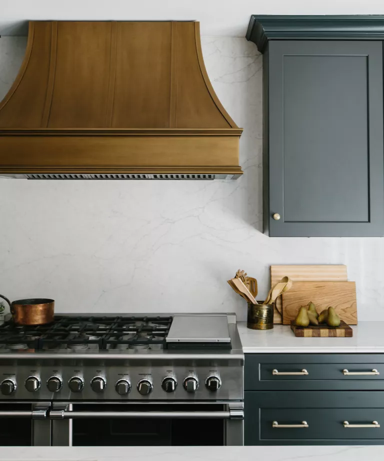
Here in this space everything in the kitchen was designed from the kitchen cabinets to the gas hood to every detail and it was a perfect combination of brass and bronze, and the crew who worked on it did an excellent job.
Kitchen island ideas also got some special treatment too. "Before presenting the design to clients, I kept my toes crossed so that they would approve the pendants over the island - and to my great happiness, they did it. I see the same pendant lights over and over again, I felt more special and a great combination of modern and traditional classic style.
"The uncoated bridge faucet also helped to introduce the traditional item along with the edge counter details.
The coffered ceilings were made by the client and the architect and I am very happy with that. He raises the ceiling and hits all the marks.
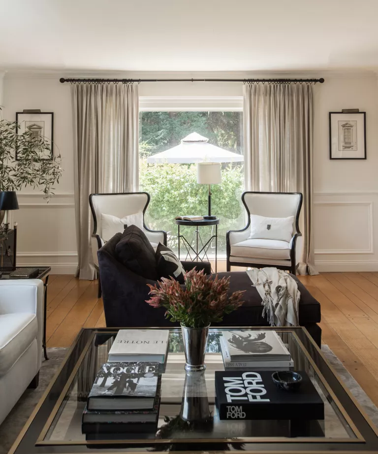
The owners wanted the house to look solemn, but the family living room always requires a softer touch. The bronze velvet chairs were put a bit stretched when it came to the budget but their warmth was absolutely necessary to dilute all the black and white.
Along with pleasant variations of a monochrome look, light white curtains also add a sense of guilt to the space. "At first they didn't know if they wanted to show off the curtains, but then they said it was the best decision they made,"the designer elaborated. "Although the curtains never close, they lighten the space and add height. The coffee table is the fireplace and the center of the room and binds together a lot of elements.
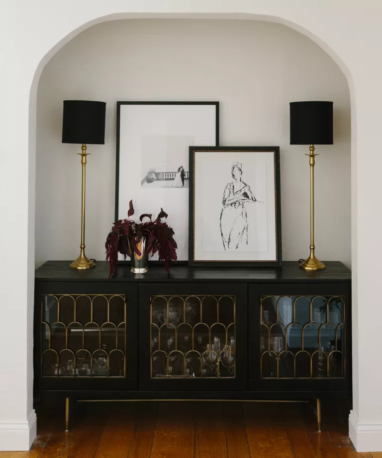
This space is considered functionally, everyday life is great and everything, but they wanted it to be a place for hosting. Gatherings and parties have been the primary focus of many career decisions.
To ensure the continuity of the color palette throughout the transitional spaces, the white-painted porthole is equipped with a black side panel that holds and displays theglassware, showing that the space is ready for celebration at all times. An antique touch is added by the gold-plated art deco-style details on the window, combined with matching color lamps, while a contemporary feel is given by the oblique artwork on the wall.
Finally, in addition to the report, you can search in our previous articles entitled The difference between design styles to find out about each bedroom and each model and its features, we also talked about the classic style, it may inspire you with an idea one day to make decorations for your spaces.
SMD decorations team in Turkey wishes you continued health and wellness.